LONDON GATWICK NORTH TERMINAL
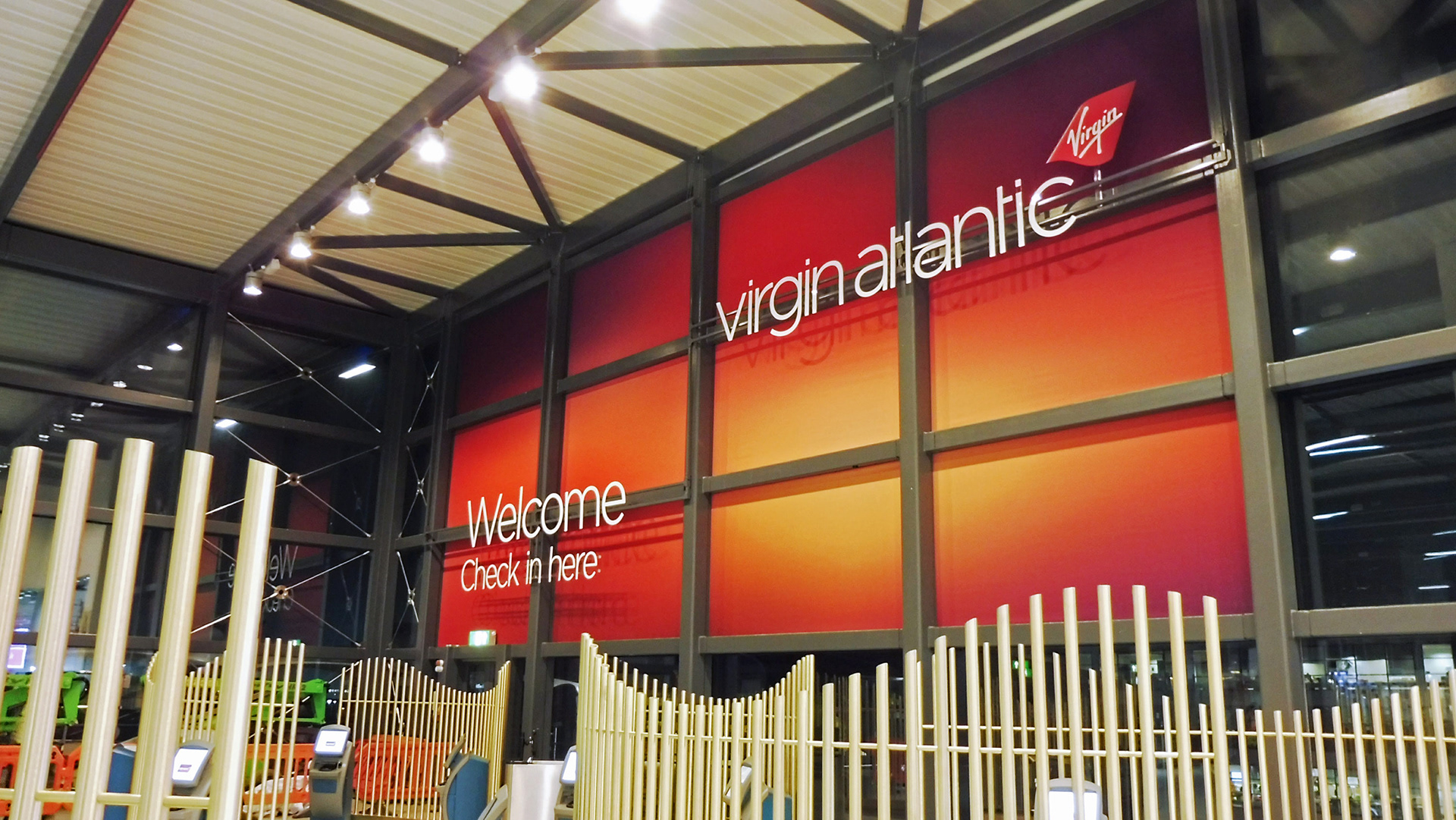
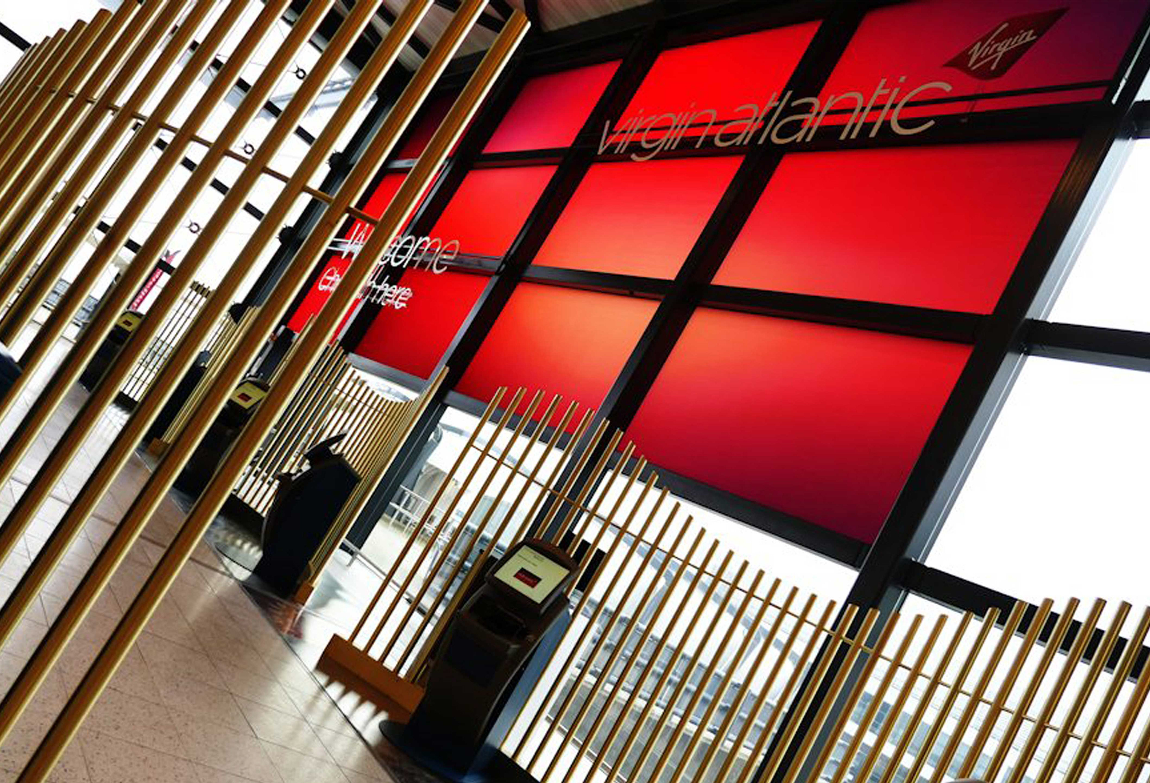
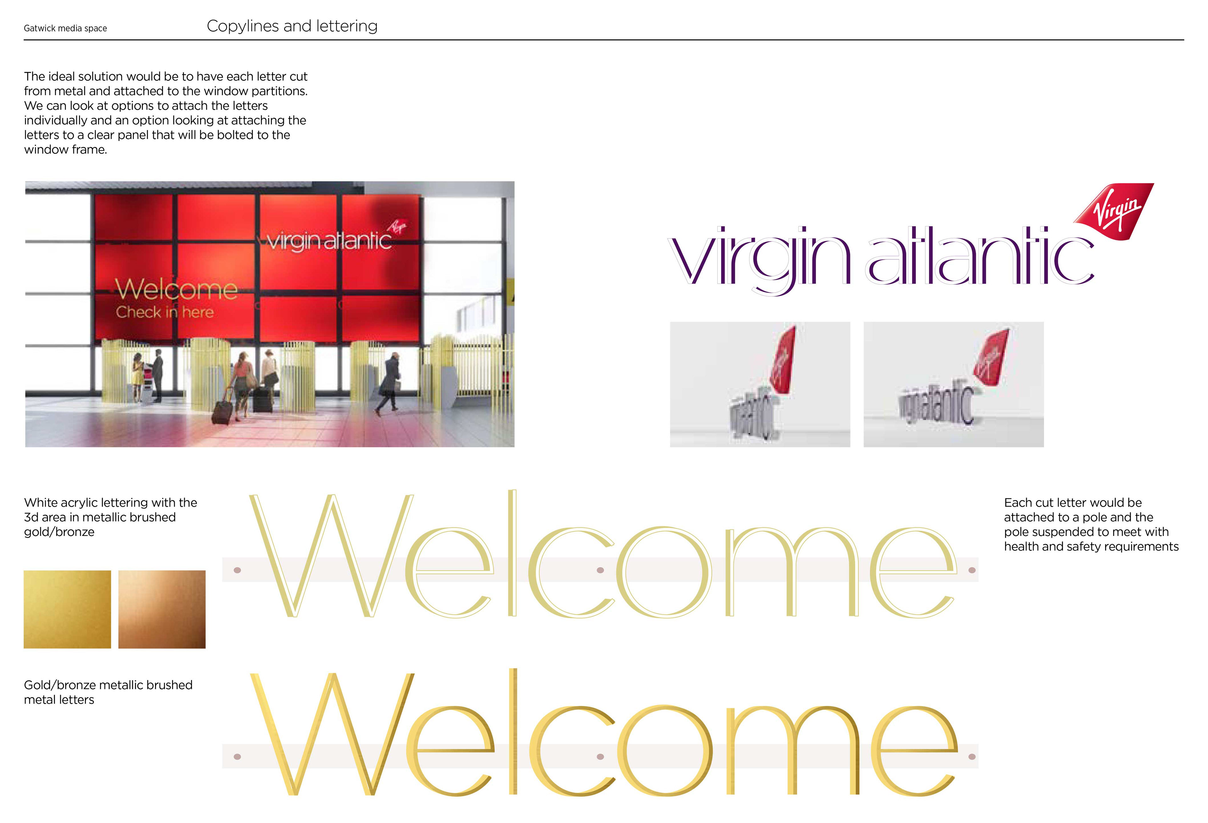
With a re-location from South to North Terminal, Virgin Atlantic's Customer Experience team approached me to design and produce a giant graphic and way finding solution to fill 12 windows at the entrance of the new airlines terminal. I wanted the solution to feel like an art installation, visually ‘wow’ the customer and create an inviting environment. The graphic had to be in keeping with the design of the space and comply with health and safety regulations.
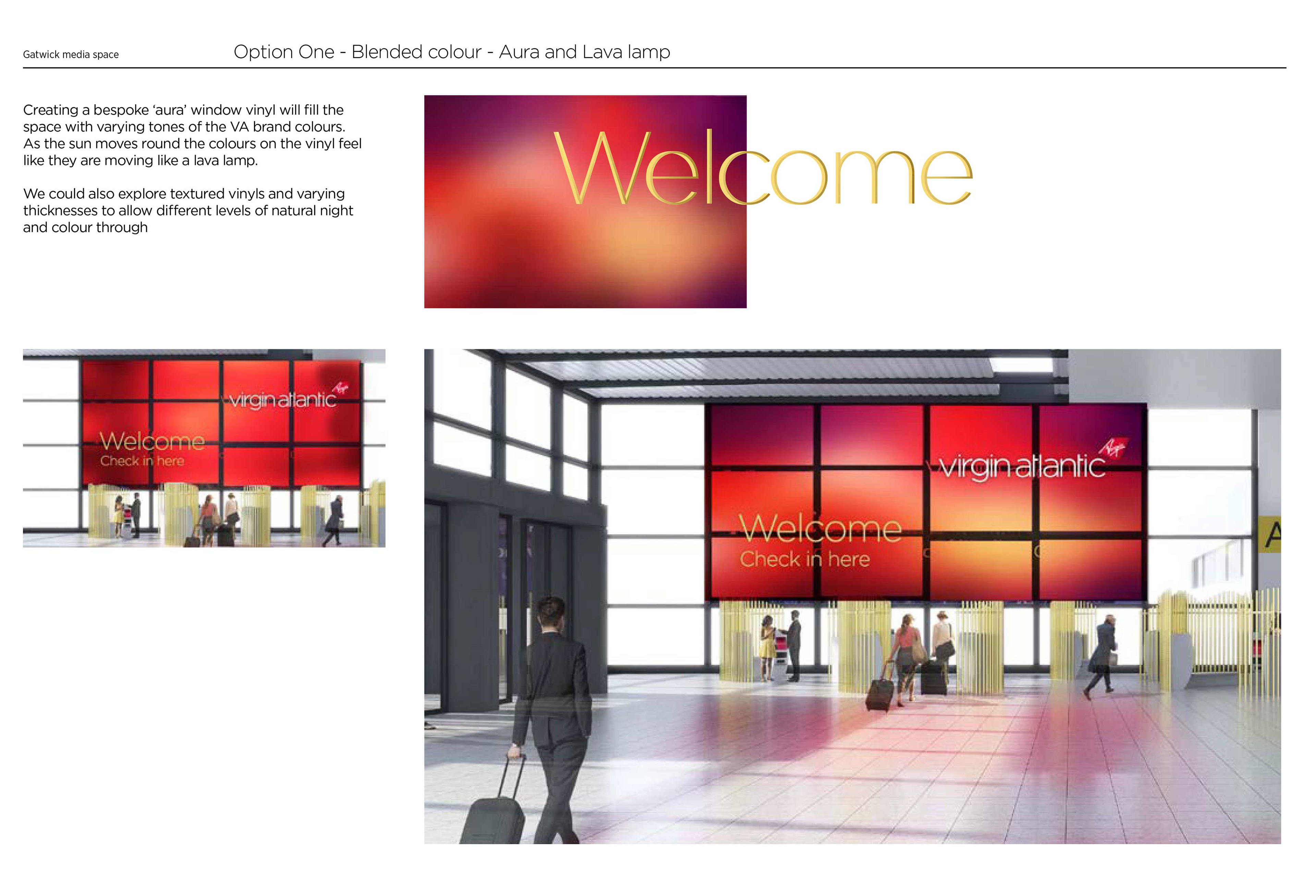
I chose to mimic some of the screen graphics used in the space, but create a stained glass effect across the windows. The mix of brand colours would flood the environment, white floors and peoples clothing with rich reds and purples during peak times. A clear way finding guide for customers. The colours create a slowly moving and calming installation as the sun moves across the sky. The way finding logo and copy is finished in gold to pick out some of the accent colours from the space.
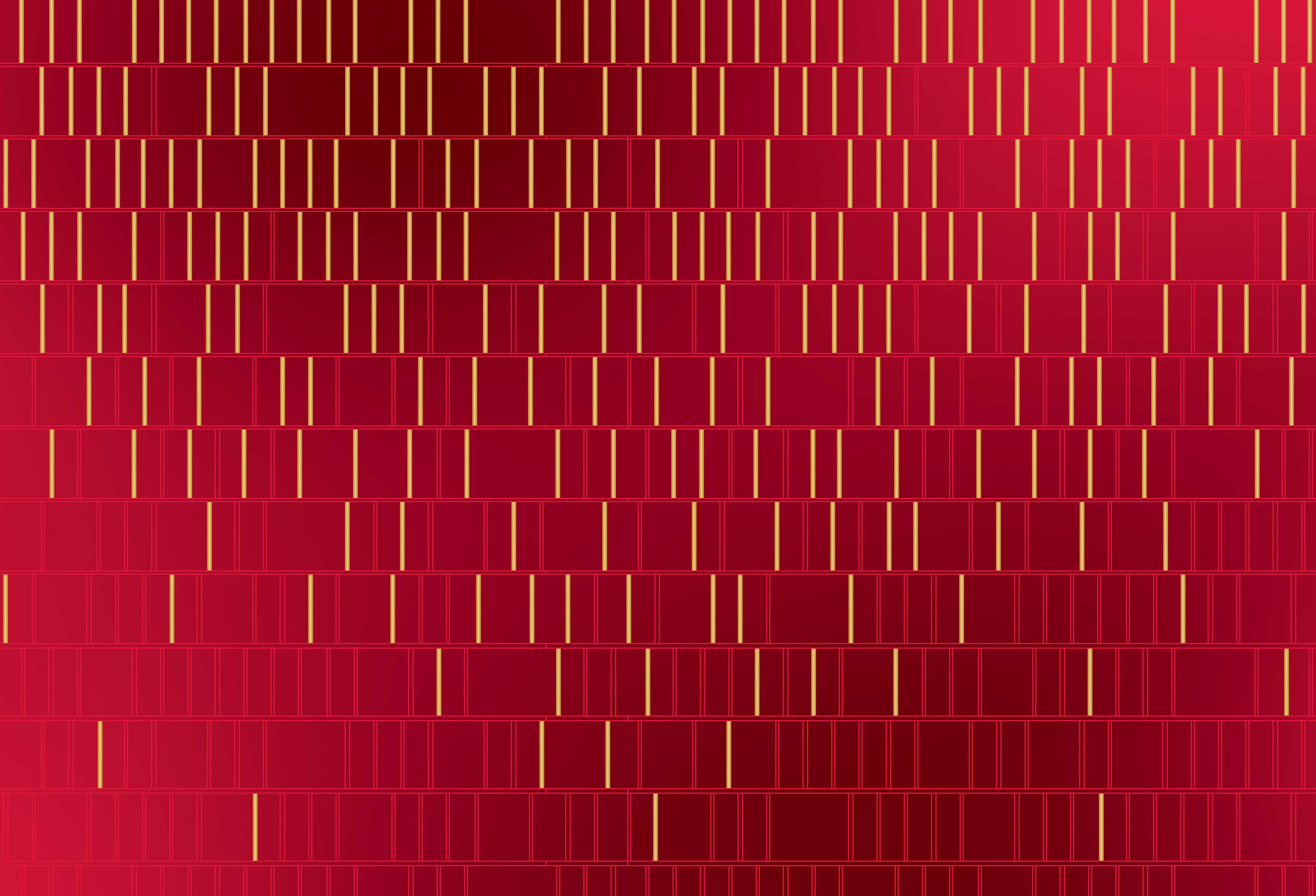
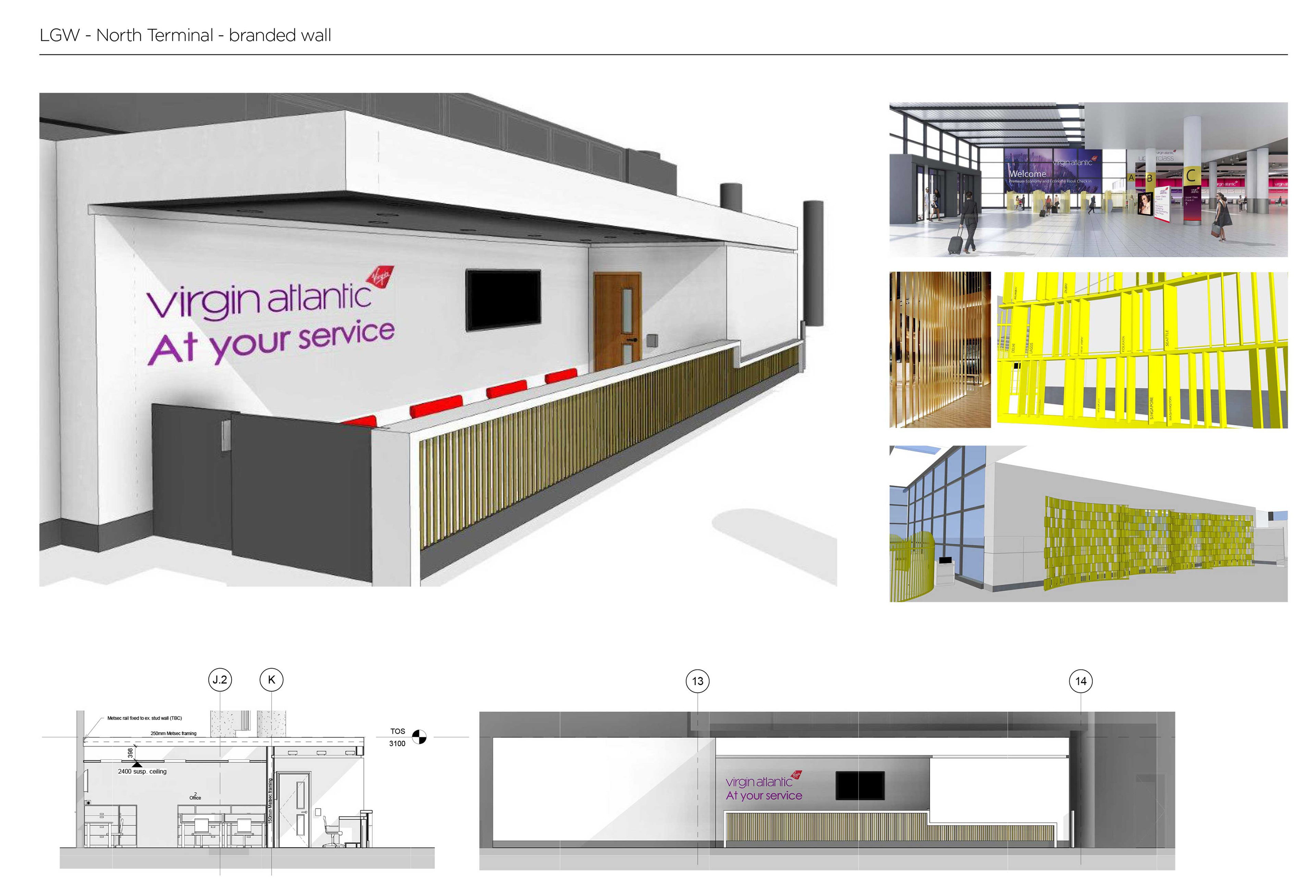
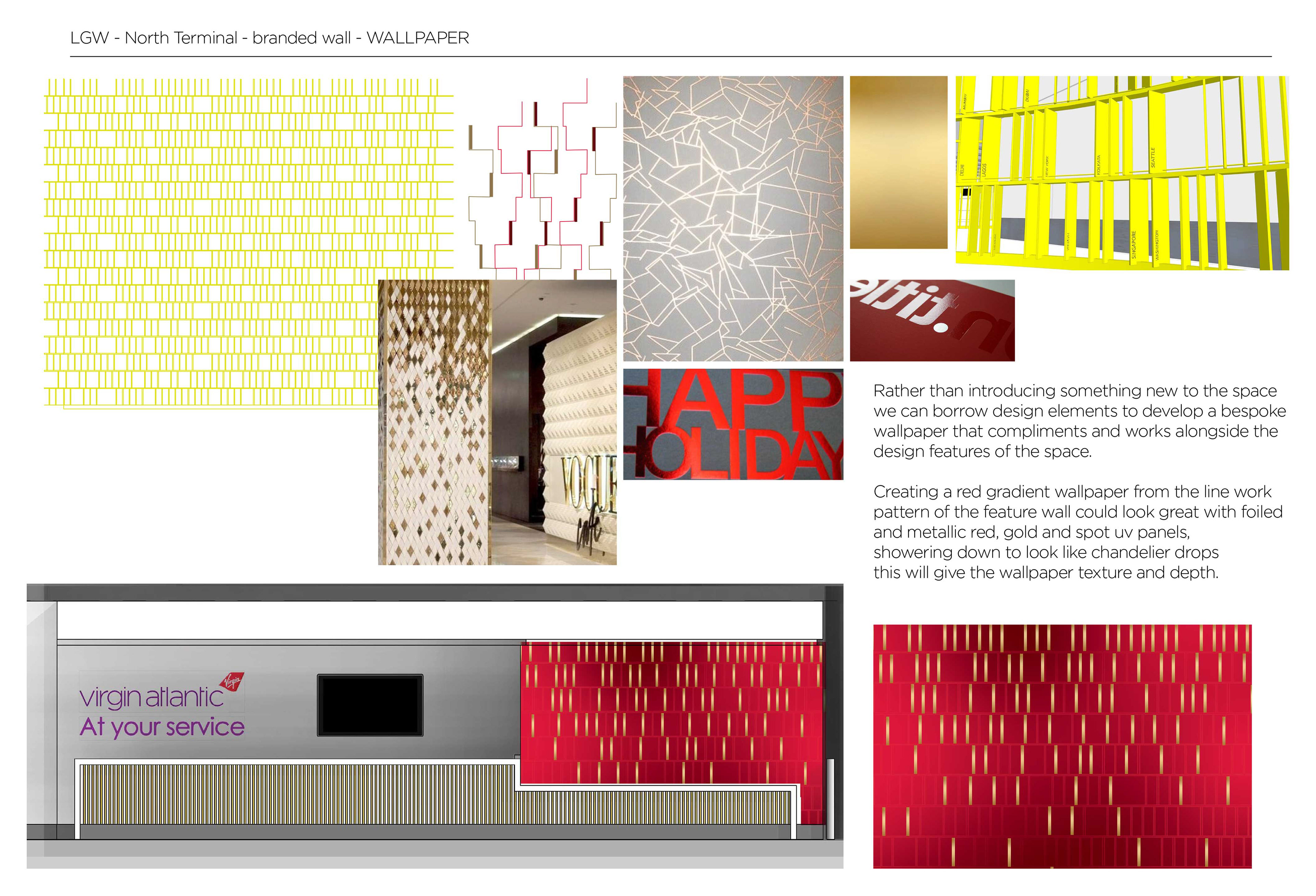
Following on from the North Terminal window installation I was also asked to create some bespoke branding for the airline and holiday companies ticket desk also in the new North Terminal space. I wanted to borrow from the architectural design elements created for the space, so there was a consistency in look and feel. My final solution incorporates elements from the feature wall at the opposite end of the space, taking the 3D wall and creating a 2D pattern from it. With a rich red gradient matt background, a spot UV linear pattern and metallic gold overlay droplets, this wall becomes an opulent feature, full of texture and depth, working for both brands.
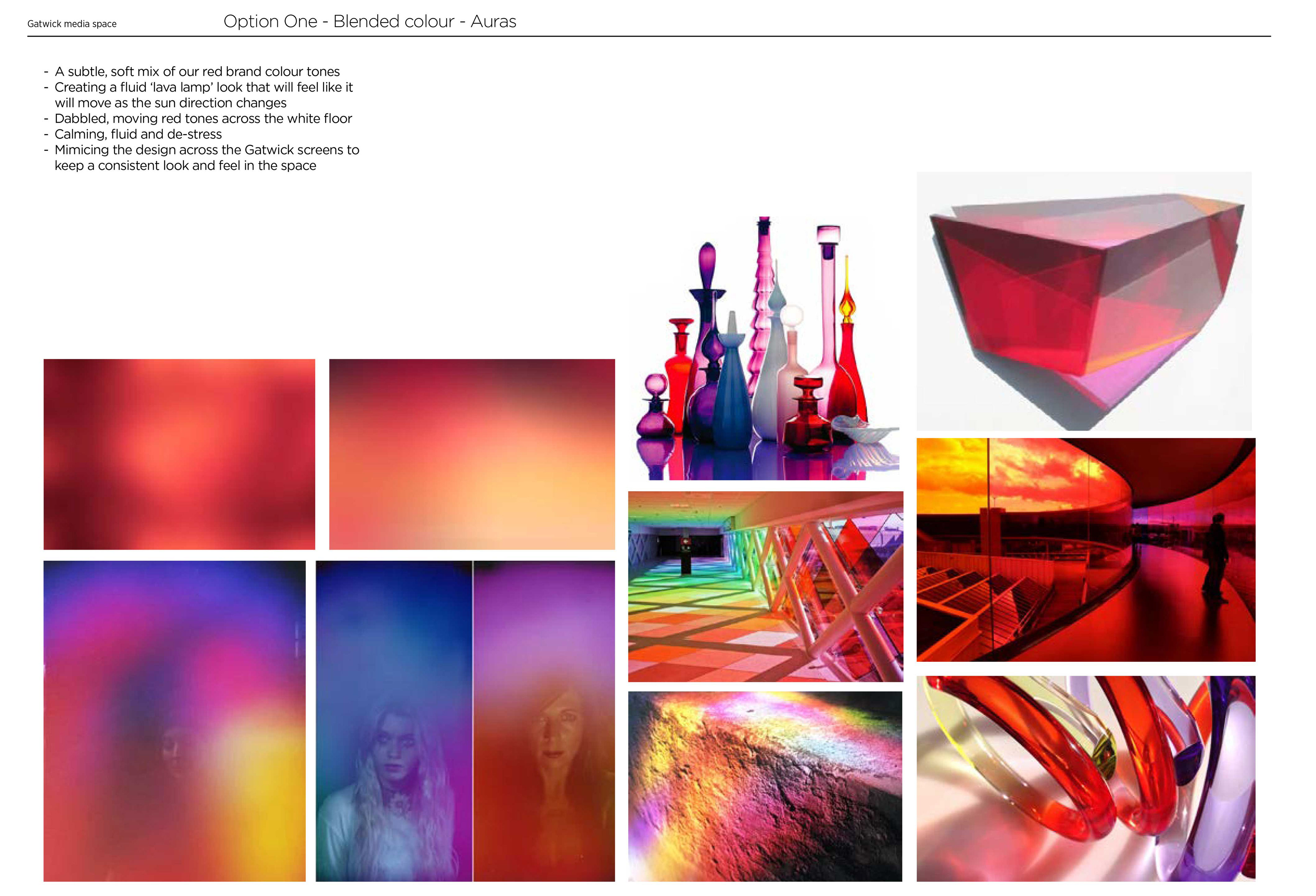
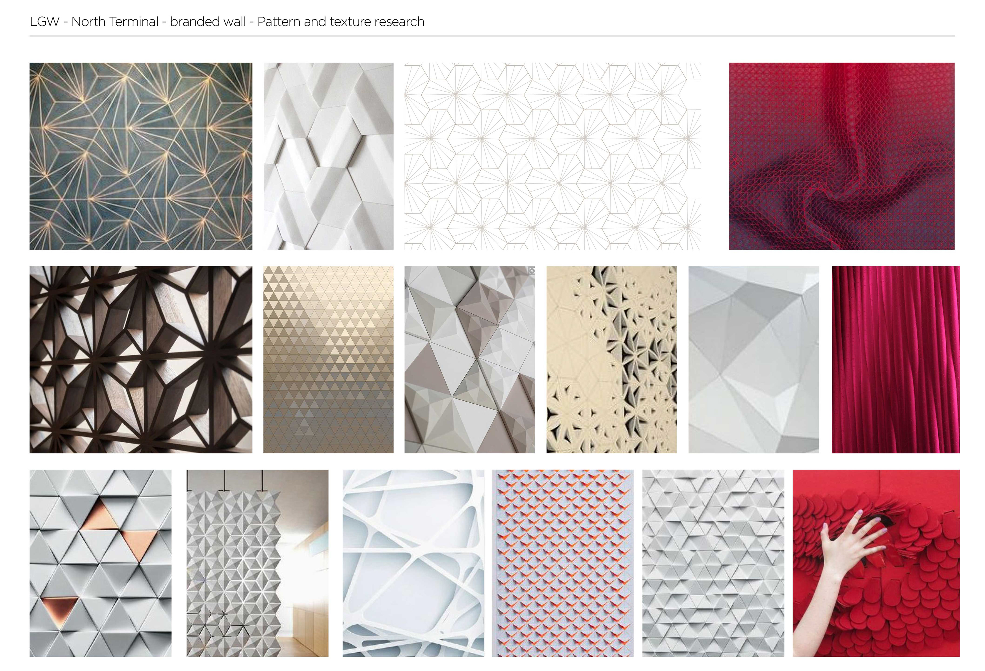
- Concepts - Moodboards
Photography approved by Virgin Atlantic
