PALLADIUM AV
A local Sussex company came to me seeking some urgent branding support. The start-up company had been really busy trading for 6 months, working with people in their network, but, with a trade event looming, this luxury audio visual design and installation company realised they didn't have a brand. They didn't have a visual identity that represented who they were and what services they offered. They needed branding support to create an identity that spoke to their audience and a suite of visual assets to support. They did have a name, Palladium AV, and a rationale for their name.
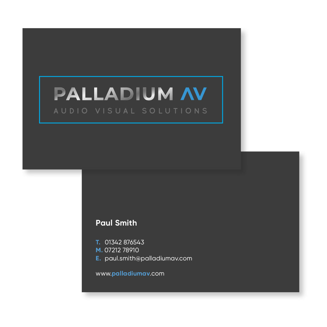
Palladium is a precious white-silver metal; it's stronger and more durable than most other metals, and it's rare. The result was a logo that visually took on the characteristics and colour of palladium, shiny and metallic with a bold, sturdy typeface. The blue neon represents the lighting colour option used in the bespoke cinema rooms.
This was a fast-paced project, turning a logo and event collateral around in a week. From concept to delivery, I worked in collaboration with the client at every step of the process. In time, we will revisit the identity and build on the visual toolkit.
- Concepts - Moodboards - Artwork - Print
- Brand identity - Business cards - Event stand - Digital assets - Web holding page - Flyer - Postcards
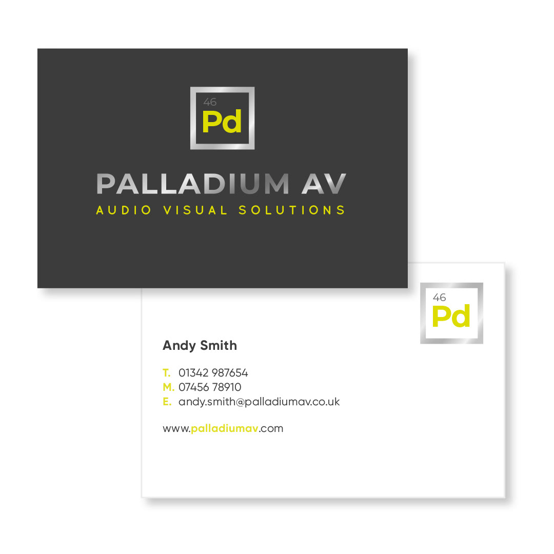
Several options were explored. Palladium is represented in the periodic table as Pd, this influenced one of the options below and the second idea that made the top 3 was inspired by the up and down buttons on the cinema room controller.


