WELLNESS SPA - REBRAND
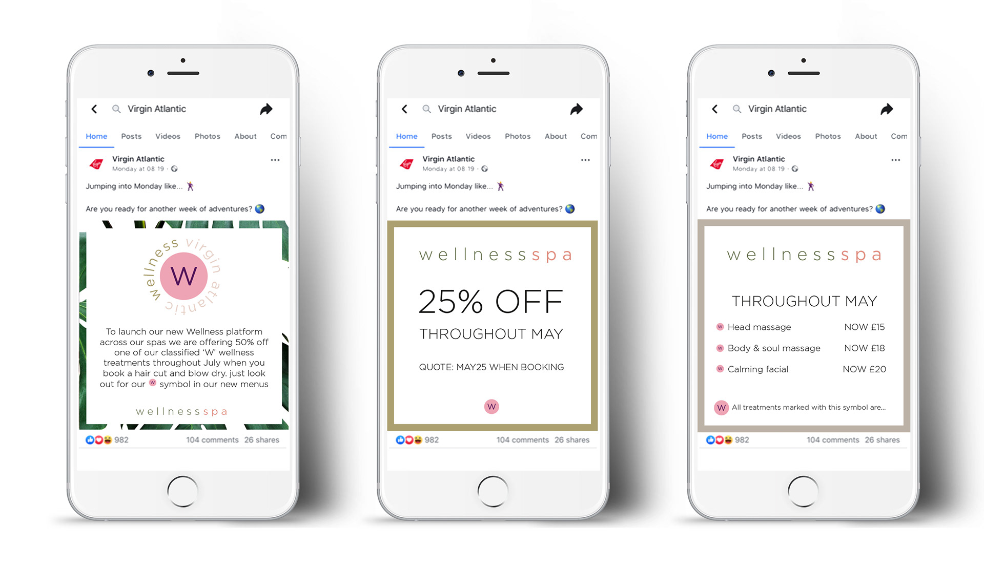
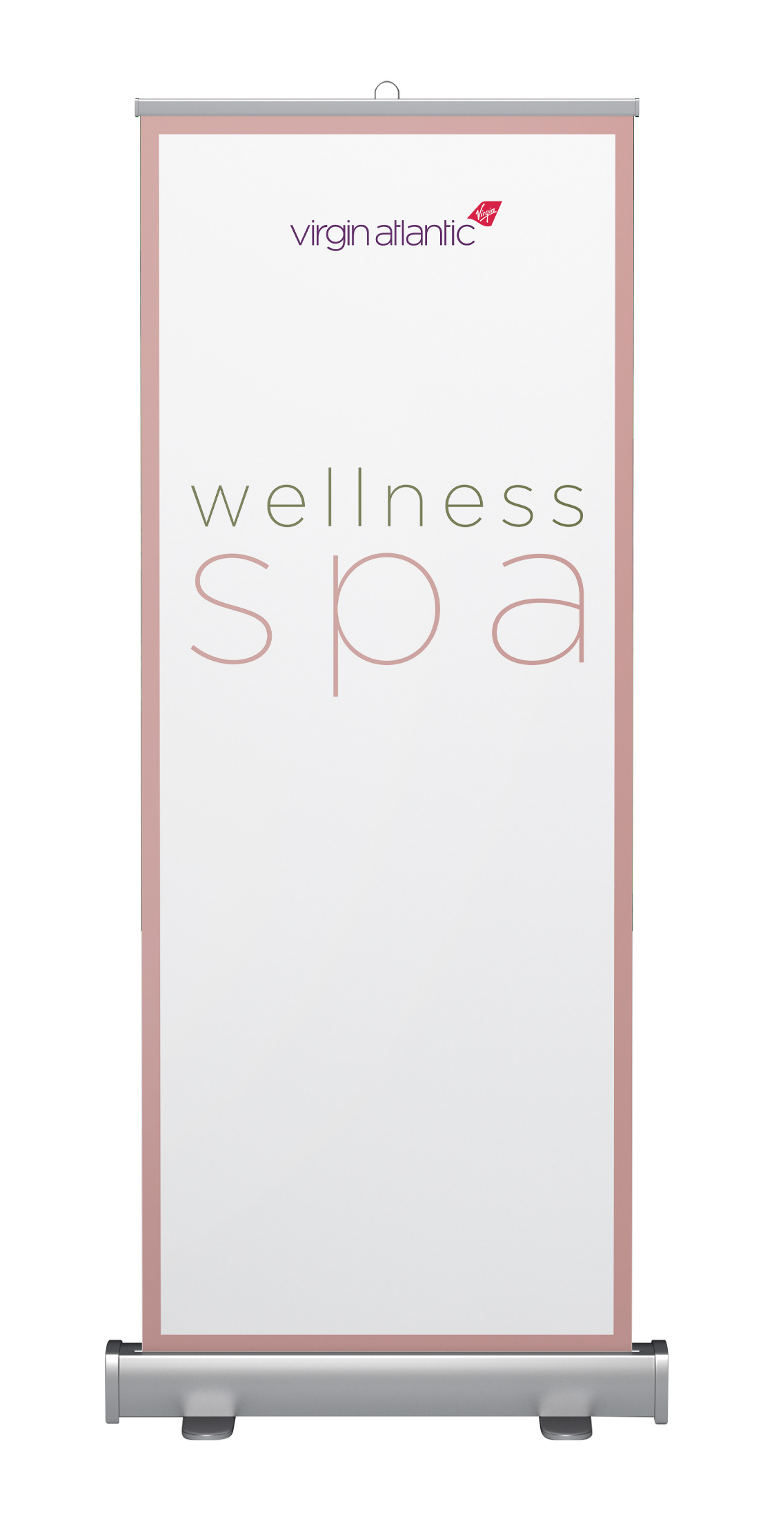
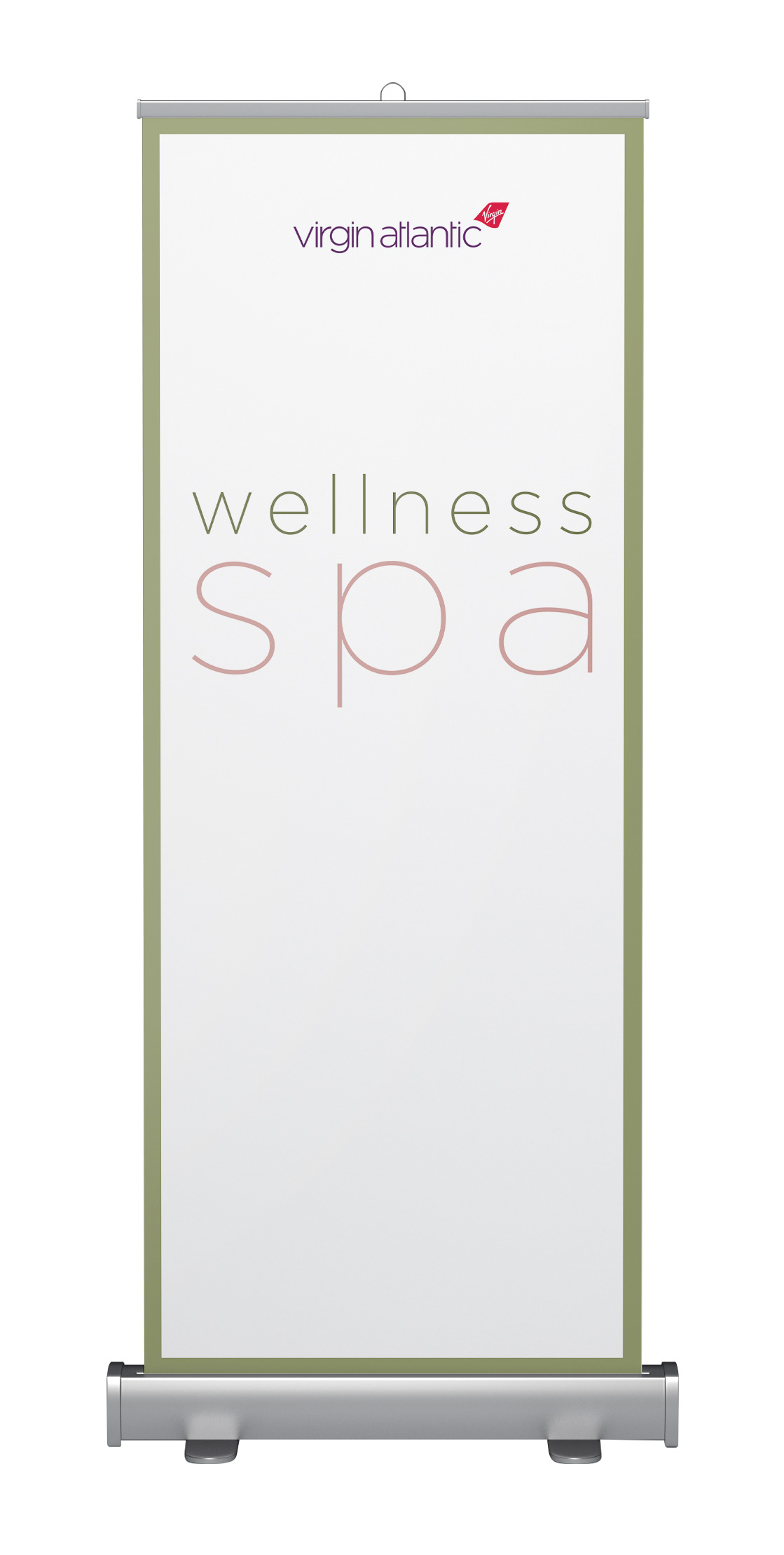
In 2019 an airline wanted to update and re position their global spa's with a brand new identity, to give leverage to their support of health and wellbeing.
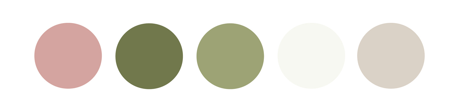
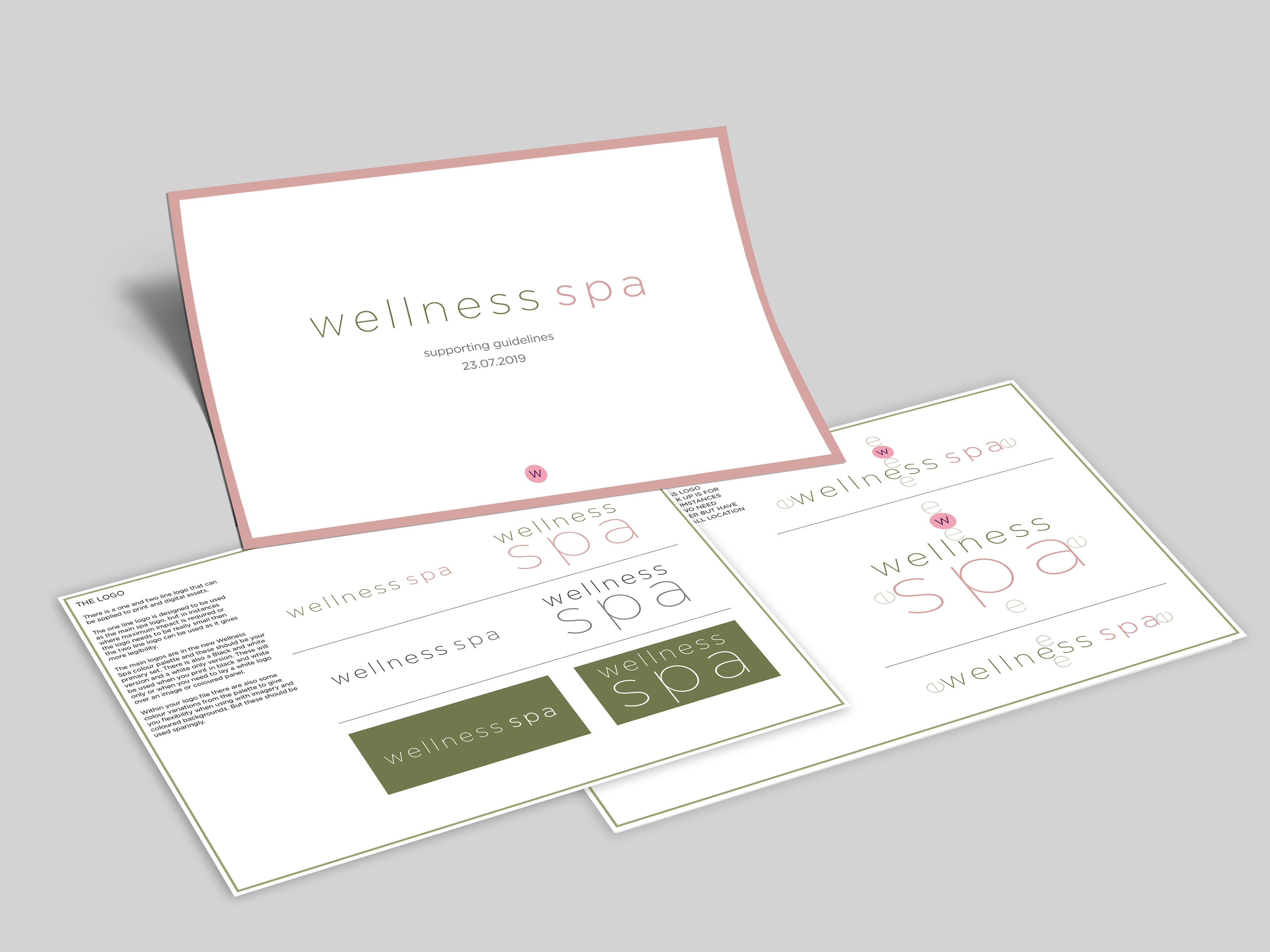
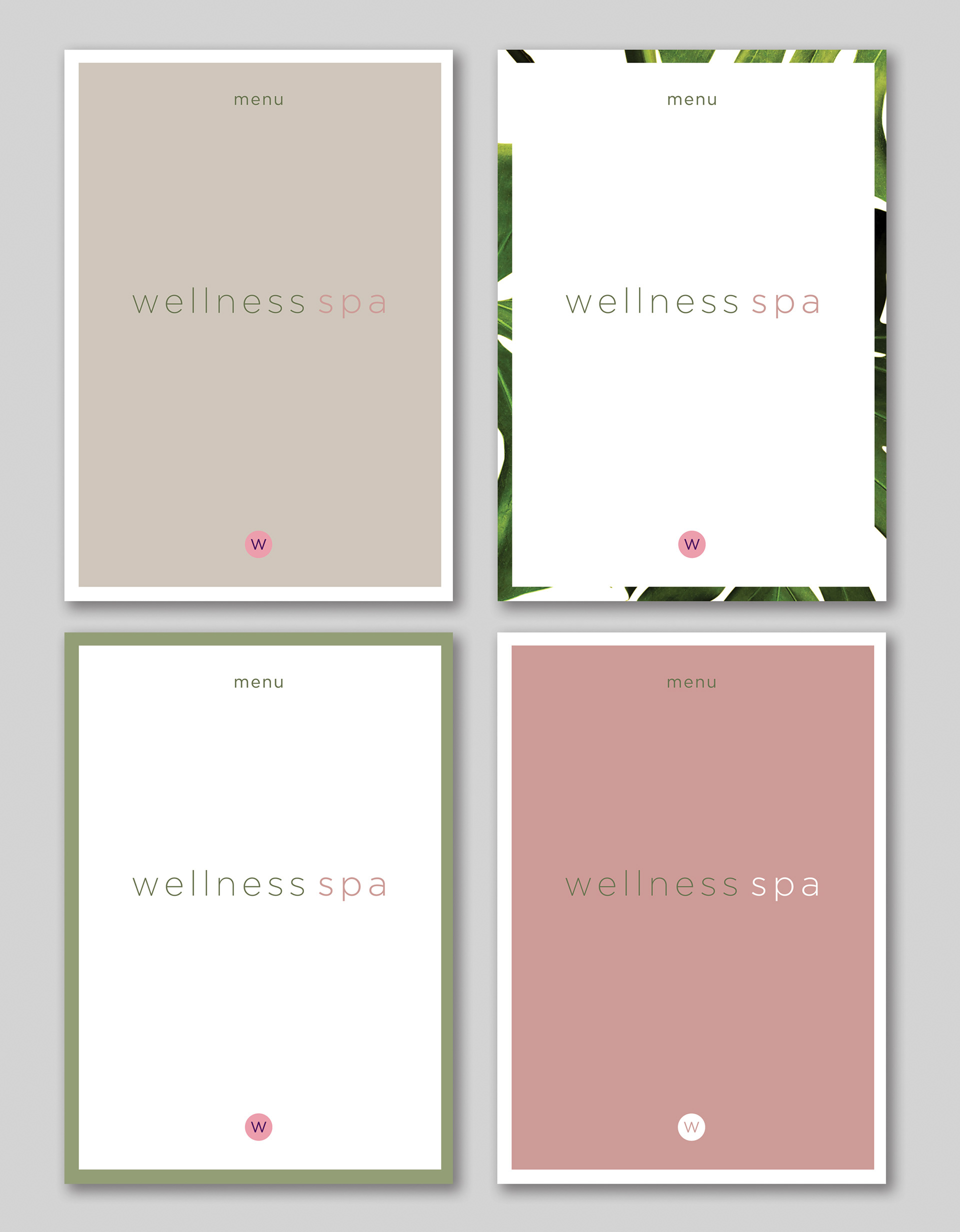
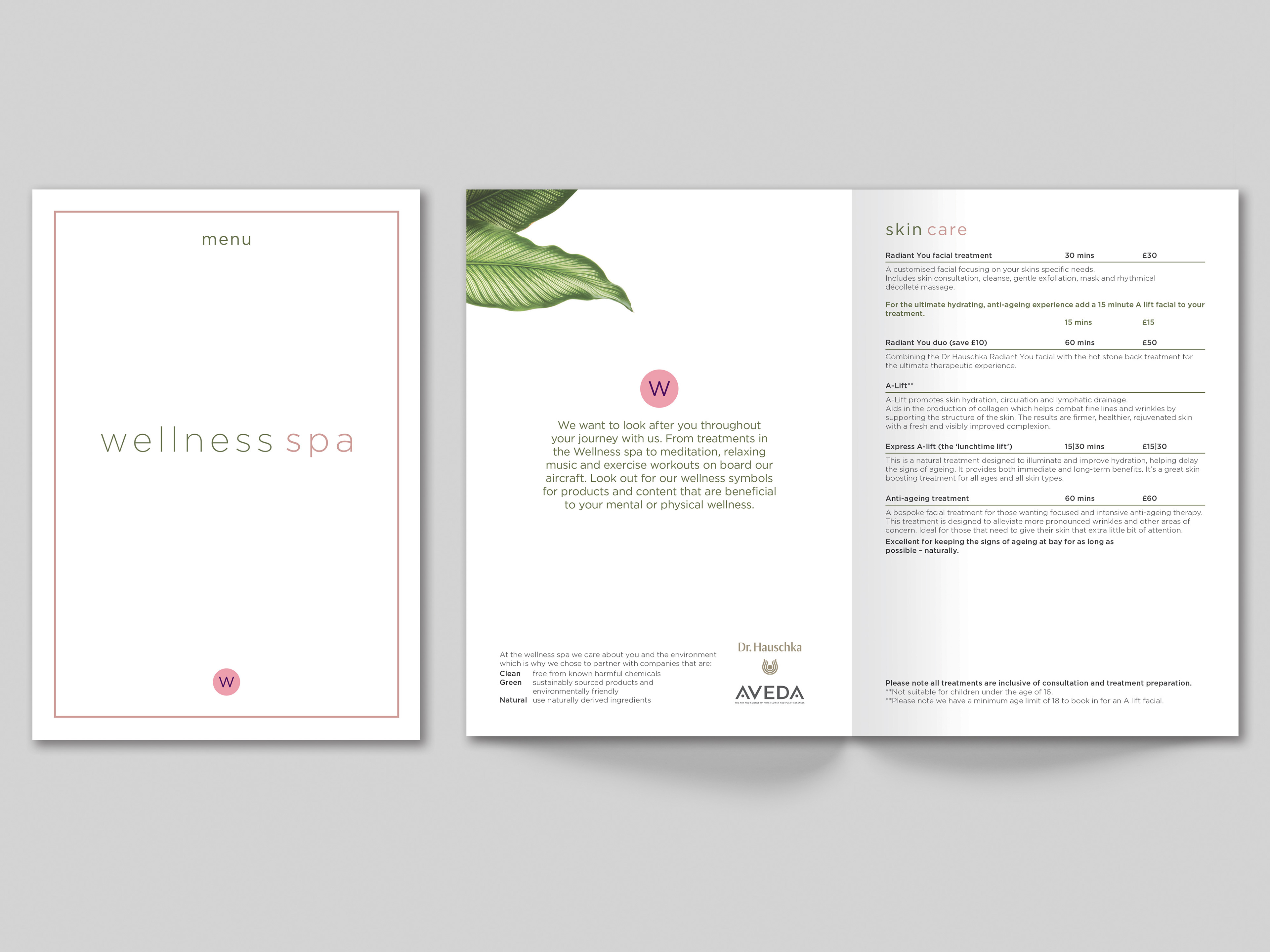
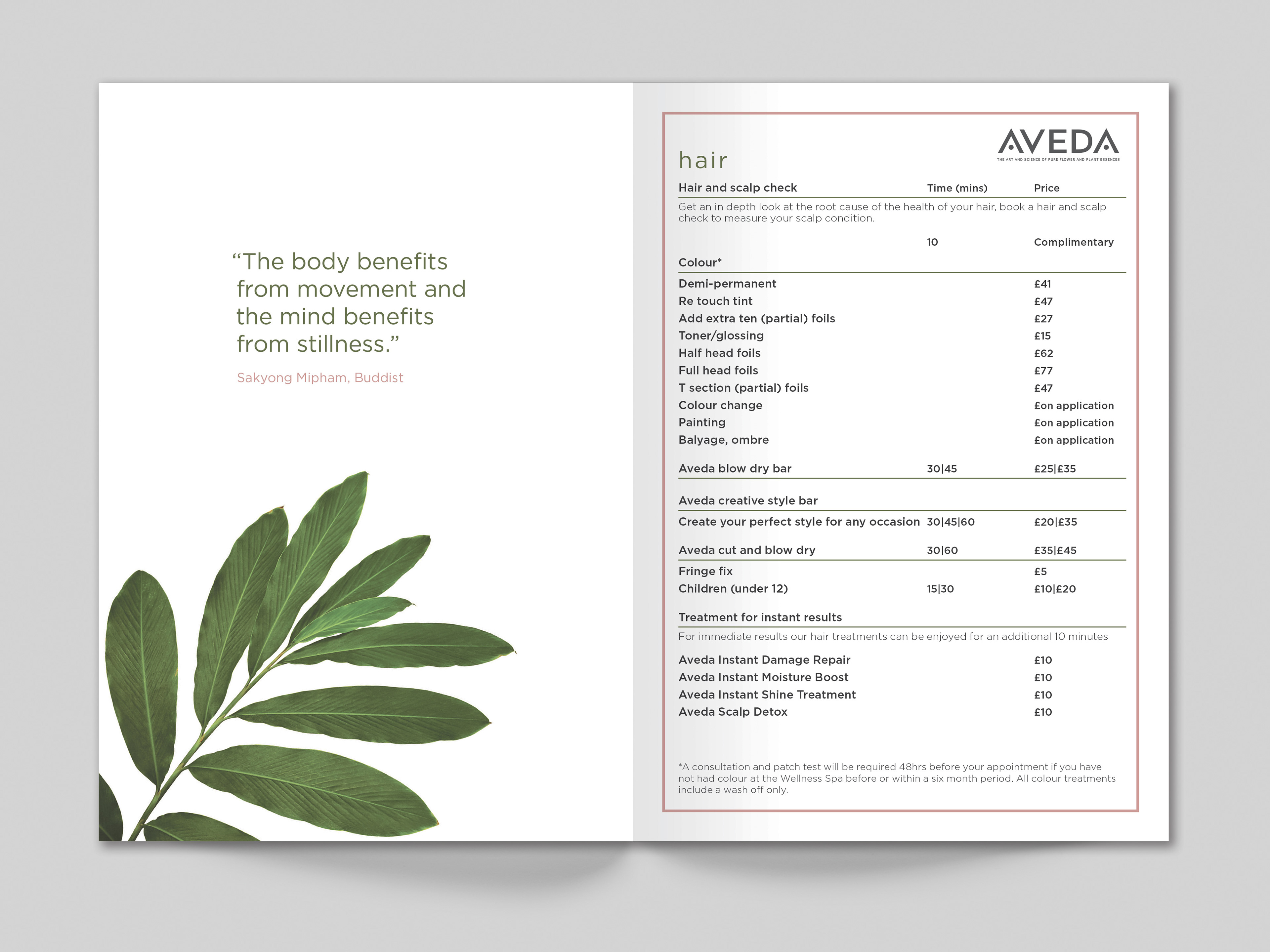
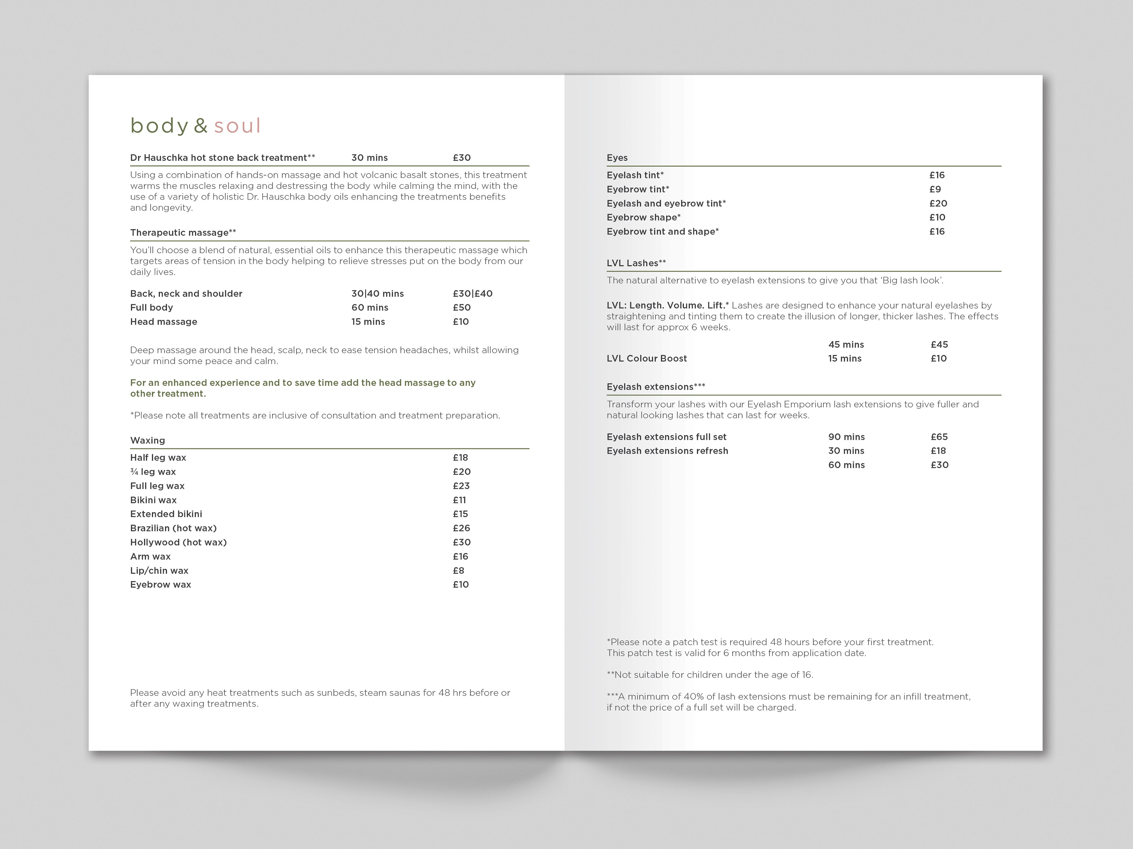
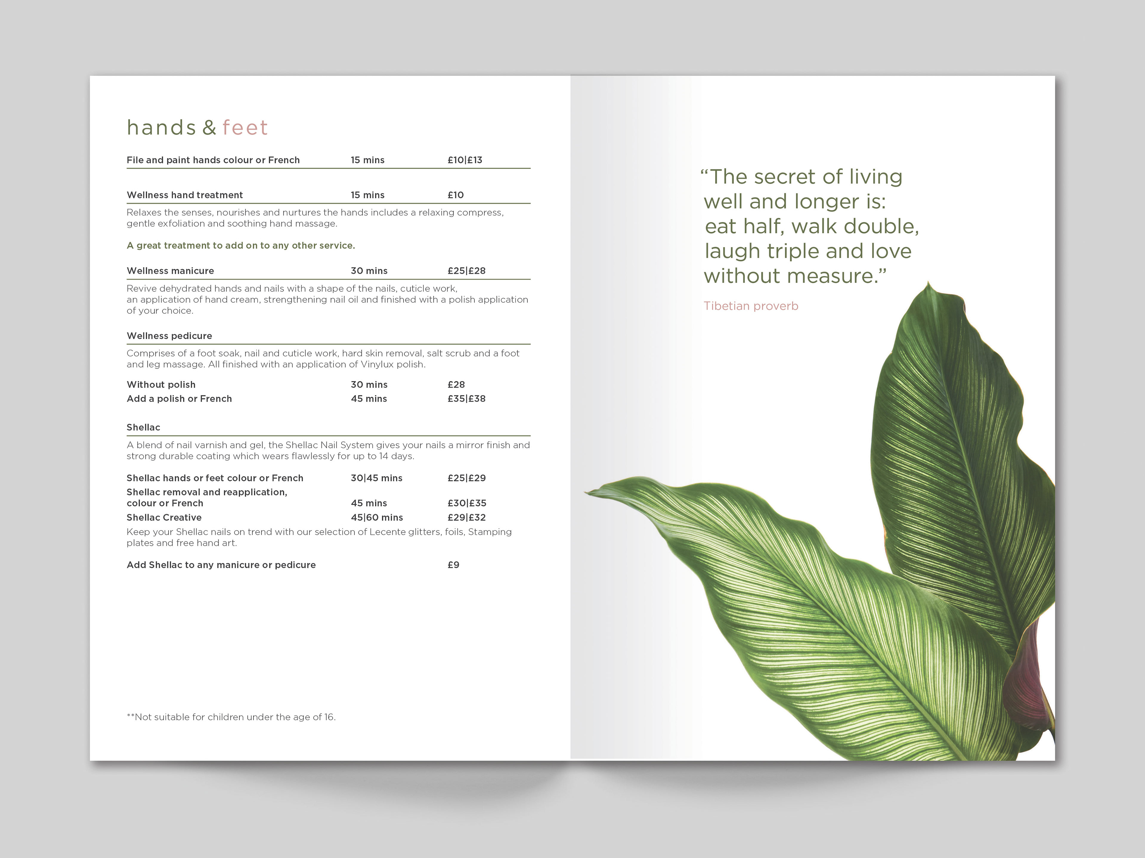
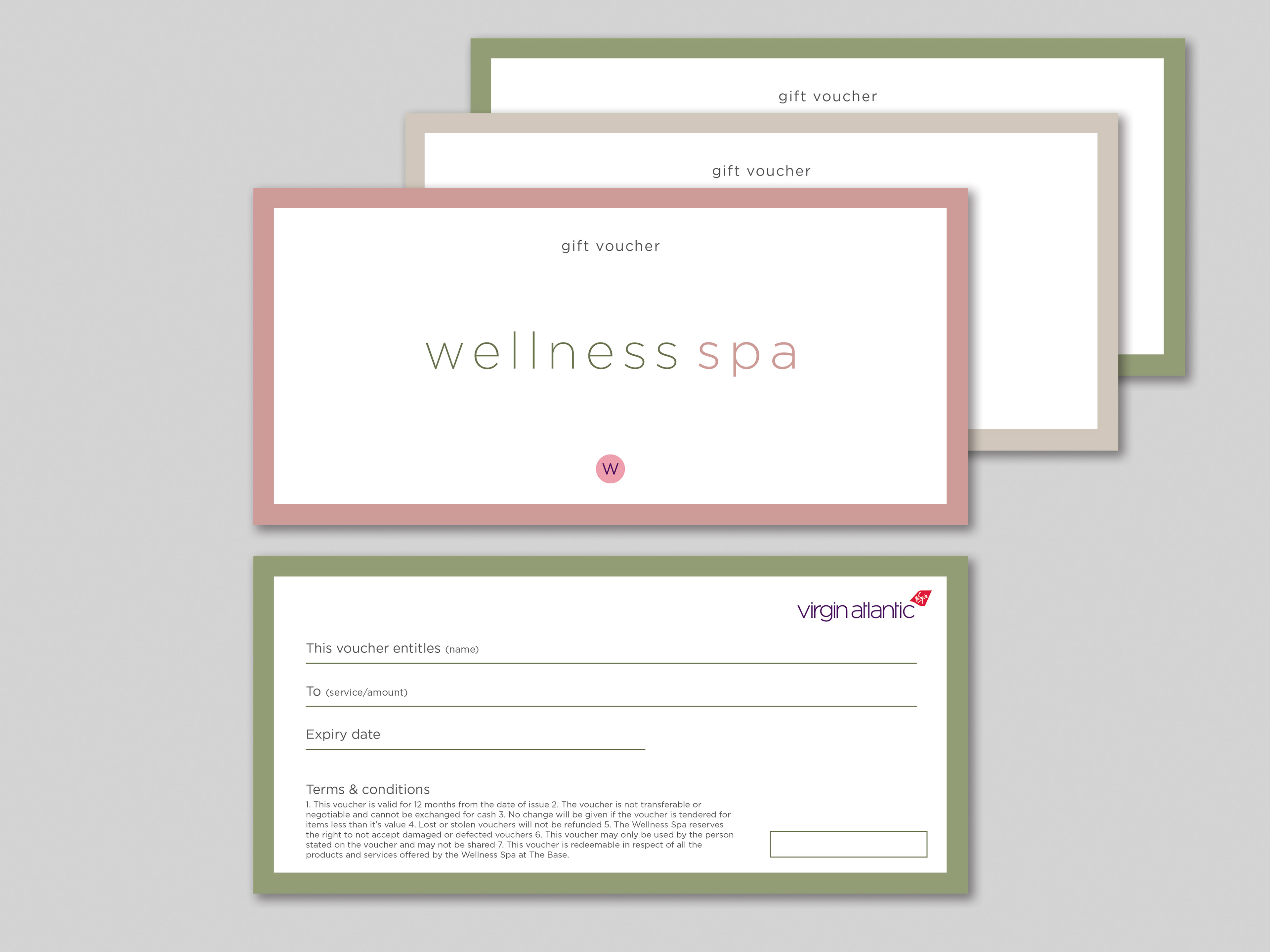
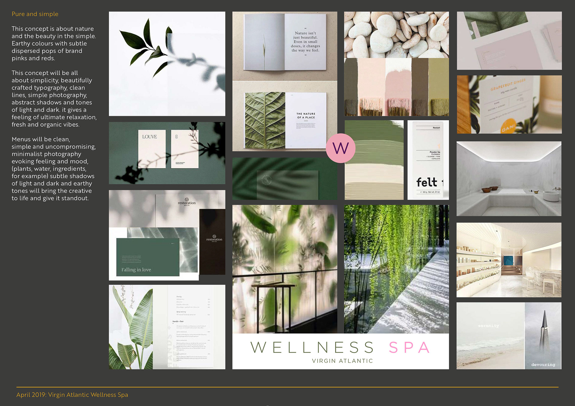
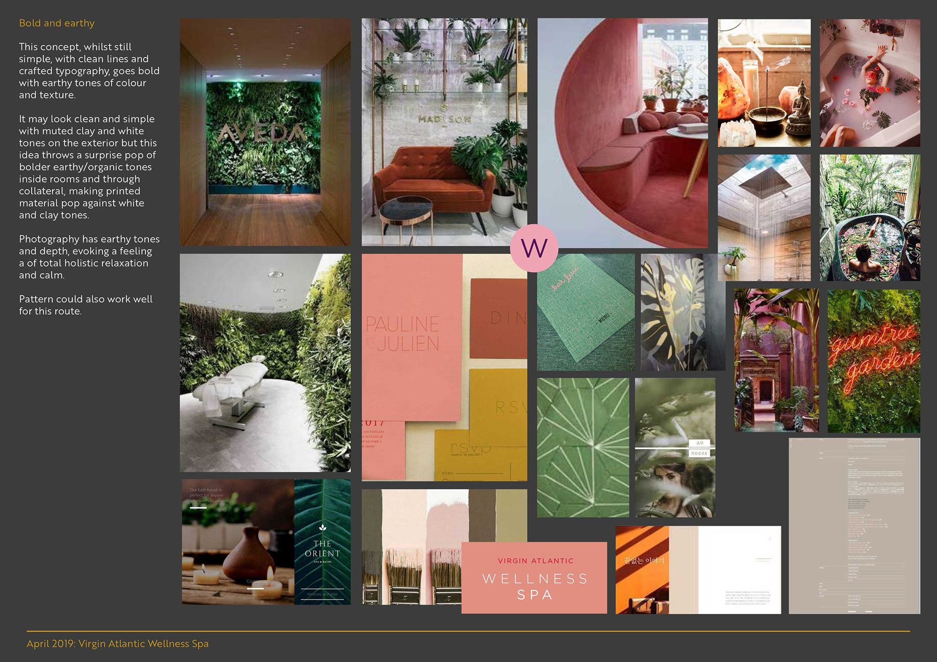
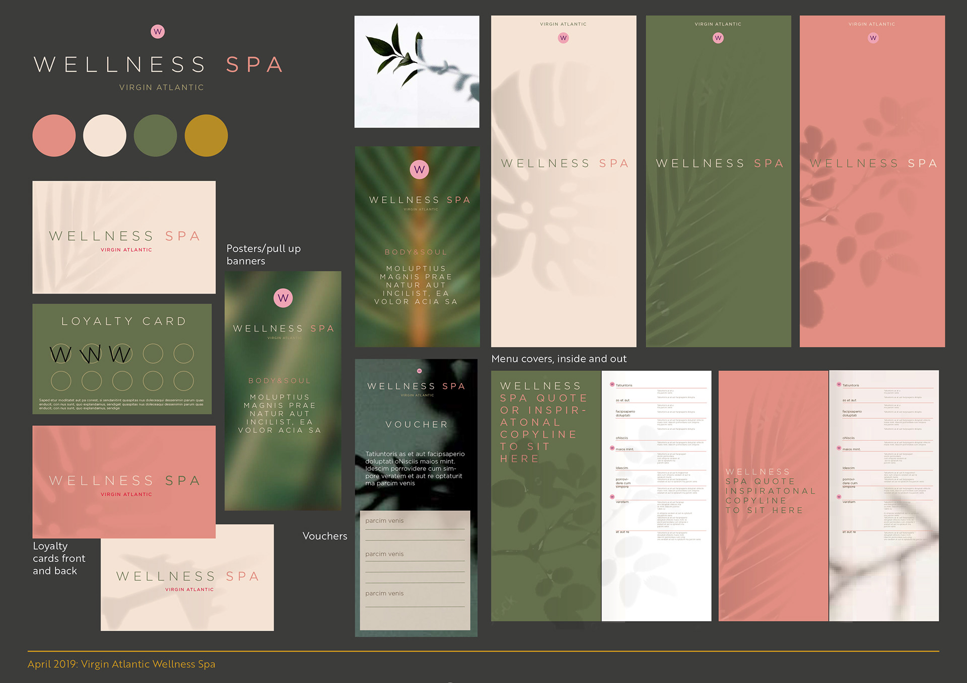
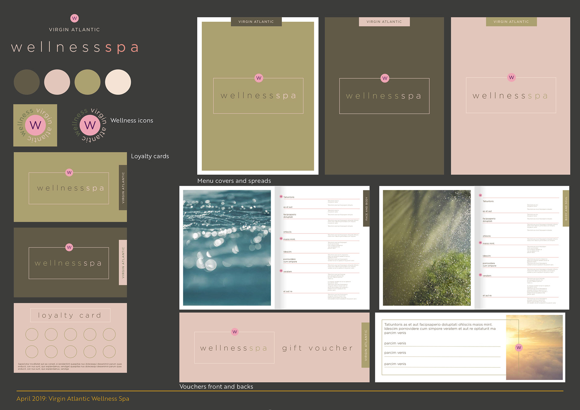
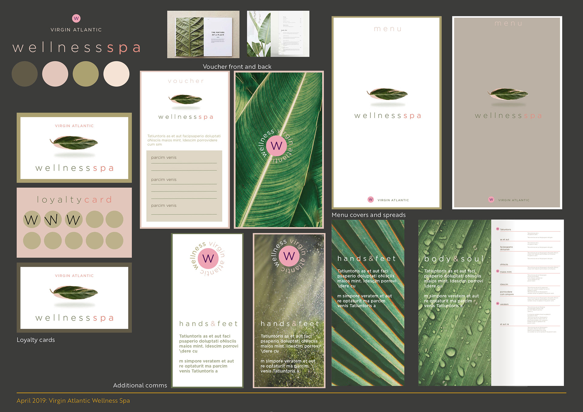
The team chose the name 'wellness spa' and wanted a more earthy and organic, minimalist feel to the creative, but still sit as part of the airlines brand. Using the existing brand font, I developed a new logo ident and more earthy colour palette, but retaining the pink tones from the brand palette to still bring some punch to the creative and work with the brand personality. Supporting the creative assets I provided a detailed set of user guidelines and templates for the spa's team to ensure consistency in the customers experience.
- Concepts - Moodboards - Artwork - Print - Digital
- Logo - Colour palette - Brand guidelines - Social asset templates - Poster templates - Loyalty cards - Vouchers - Menus - Pull up banners